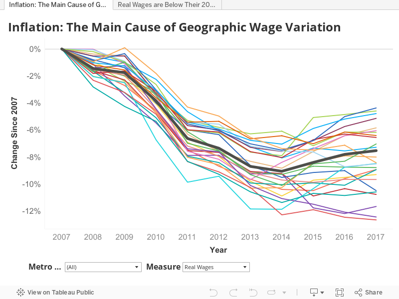
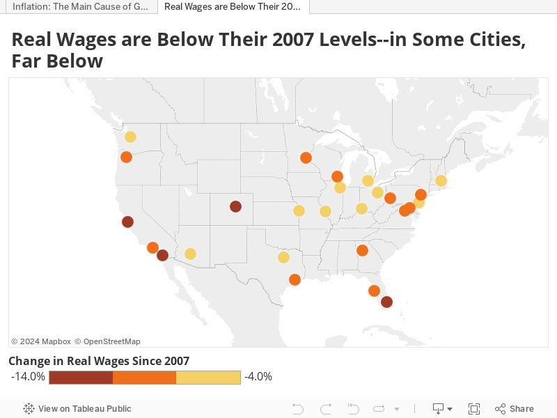
It has been over a decade since the start of the Great Recession and workers are still feeling the squeeze. As of December 2017, real wages at the national level — wages after controlling for inflation — were 7.7 percent below where they were in 2007. However, workers in some cities are feeling the pain much more than others. For example, workers in Miami experienced a 12.6 percent cut in their spending power between 2007 and 2017, the largest drop for any of the cities in our sample. Meanwhile, workers in Cleveland did better than those in any other city we looked at: their real wages fell only 4.4 over this same period. (I said they did better, not that they did well!)

“Inflation: No Chance to Increase Finance”
Two factors drive these wage differences between cities. First, nominal wages — the numbers that workers see on their paychecks — have grown unevenly across cities. They grew the fastest in Seattle, where workers saw their pay increase by 14.3 percent in the decade after the start of the Great Recession. Miami saw the slowest nominal wage growth over that same decade: workers took home only 5.3 percent more in 2017 than they did in 2007.
Second, inflation rates, as measured by the Consumer Price Index (CPI), have varied greatly by metro area. No surprise here – the metro area with the highest inflation rate is San Francisco-San Jose. Prices grew by a whooping 27.3 percent between 2007 and 2017. Detroit, on the other hand, saw prices increase by 13.4 percent, less than half the increase experienced by residents of San Francisco-San Jose.
These large differences in inflation are the main reason why real wage growth has varied widely across cities. It is also the reason why workers in some of the hottest markets have seen their purchasing power decrease more than workers in more sluggish job markets.

“Make Me Wanna Holler”: Hottest Markets Take the Biggest Hit to Real Wages
While Silicon Valley (broadly defined to include both San Francisco and San Jose) may seem like the place to go if you want to make a fortune, the data tell a different story. Yes, nominal wages have been growing at a fast clip, but CPI has been growing more than twice as fast in that region. The result is that real wages in the land of “milk and honey” fell by close to 12 percent in the decade after the Great Recession.You might have even seen headlines like this: “In San Francisco a family of four that earns $100,000 is ‘low-income‘”.
The Bay Area is not the only “hot” market to see such a large decline. Denver, Portland and Pittsburgh have all had nominal wage growth of over 10 percent in the decade following the Great Recession—growth that has been more than gobbled up by increases in the cost of living. Real wages fell by 12.4 percent in Denver (the second largest drop in our data set), 10.5 percent in Portland and 8.9 percent in Pittsburgh.
Due to its rapid nominal wage growth, Seattle was the one “hot” market that did better than the national average. But even with that growth, Seattle couldn’t get wages to their pre-2007 levels. Its 21.8 percent inflation rate resulted in a 6.18 percent decrease in real wages.
For many of these hot markets, housing prices have played a key role in driving inflation up and people’s purchasing power down. According to the Case-Schiller Index, housing prices in San Francisco grew 17.3 percent in the decade after the Great Recession. Housing prices in Denver increased by 46.2 percent.
“Throw Up Both my Hands”: Rust Belt Cities Do Better for the Wrong Reasons
The cities where workers have done comparatively well in terms of real wages – Detroit and Cleveland – are cities that have struggled economically for decades.
In economics, there is a very clear relationship between inflation and wages: as wages increase, there is more money chasing after goods, which drives up prices. That prices grew 13.3 percent in Detroit versus 27.5 percent in San Francisco indicates that there was less money flowing into Detroit.
This is clear not only from the nominal wage numbers (nominal wages grew 8.2 in percent in Detroit versus 12.4 percent in San Francisco), but also from the unemployment figures. During the Great Recession, Detroit’s unemployment rate hit 16.4 percent. In San Francisco, it peaked at 10.1 percent. In both metro areas, employment has recovered, but Detroit’s unemployment rate was still 1.5 times greater than San Francisco’s in December of 2017.
“This Ain’t Livin’”
There is a whole branch of economics dedicated to showing how and why recessions caused by financial crises are both longer and harder than those caused by other factors. Workers don’t need to understand complex math to realize this. They know all too well that they are less able to pay for housing, food and school than what they were in 2007.
You don’t need to stand idly by as your purchasing power dwindles, especially not if you are in a hot market or have in-demand skills. You can ask for a raise. Our research has shown that 70 percent of workers who asked for a raise got one. But before you march into your boss’s office, do some homework. Find out what inflation is like in your area. More importantly, figure out what’s fair compensation for people in your role and in your market. You can take PayScale’s salary survey to find out what you’re worth.
Methodology
We looked at real wages between 2007 and 2017. This time frame was chosen partially based on availability of data from the Bureau of Labor Statistics (BLS). In January 2018, the BLS adopted Core Based Statistical Areas as their geographical unit for reporting CPI and stopped reporting CPI figures for some metro areas. To avoid dealing with this structural break in the data and discontinued data series, we have chosen to look at data only until December 2017.
To calculate city real wages, we used the metro definitions employed by the Bureau of Labor Statistics from January 2003 to January 2018. For more information about the past and current metro definitions, please see https://www.bls.gov/cpi/additional-resources/geographic-revision-2018.htm.
The real wage index was calculated using the PayScale Nominal Wage Index, which follows changes in total cash compensation for full-time, private industry employees and educational professionals in the U.S.
For more detail about how the PayScale Index is calculated, please see the following:
- Methodology: https://www.payscale.com/payscale-index/compensation-trends-methodology
- FAQ: https://www.payscale.com/payscale-index/compensation-trends-faq
- How the PayScale Index compares with other data sources: https://www.payscale.com/data/payscale-index-vs-eci
More information about PayScale’s proprietary compensation model can be found at https://www.payscale.com/data/payscale-methodology-explained.
To calculate the annual real wage index, we averaged both the PayScale nominal wage index as well as the CPI for the year.
Credit to Marvin Gaye, whose lyrics to Inner City Blues (Make Me Wanna Holler) have inspired the title and headings of this post.
Leave a Reply