This summer, news has broken that wage growth is up, down, and flat. What gives? The fact is that earnings are keeping pace with inflation for some groups, and falling behind for others – sometimes far, far behind.
In the 1980s, as Americans were struggling through years of stagflation, Ronald Reagan asked: “Are you better off than you were four years ago?” For most, the answer was a resounding no.
Today, Americans are struggling through another strange economic reality. Unemployment is low, growth has been steady and by some measures, wages have rebounded from the Great Recession. Still, many Americans are failing to see the economic boom translate into a better financial situation for them and their families.
To understand how average wages can rise while leaving most Americans behind, we need to understand the differences between economic indicators as well as some nuances in the underlying data. In this post, we argue against one of the most common measures of how the typical American worker is faring: the average hourly wage rate1.
What’s wrong with “Average Hourly Wage Rate”?
There are various ways to measure the middle point of a data set, with the mean and median being the most common. The mean is more sensitive to skewed data than the median. This isn’t inherently good or bad, and sometimes it doesn’t matter. When it comes to wage growth, however, the way we measure the “middle” really matters.
The average hourly wage rate is a misleading indicator when it comes to Americans’ wages, because wage growth is so unevenly distributed across the earnings spectrum. Only looking at the average hourly rate paints a rosy picture of wage growth that hides flat or declining real wages for most American workers behind the gains of relatively few. We can see how many workers are being left behind by looking at the percentiles of weekly earnings.
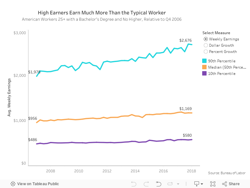


Weekly Earnings Percentiles
Our first graph above shows the 10th percentile, median, and 90th percentile2 of weekly earnings over time for workers over 25 with a bachelor’s degree3. The distance between the low earners and the median worker doesn’t change dramatically over time. The median worker consistently earns about twice what a worker at the 10th percentile does, a difference of $470 in Q1 2007 and $589 in Q1 2018. However, because high earners saw much faster wage growth, the distance between the median worker and one at the 90th percentile widens much more, from $1,022 in Q1 2007 to $1,507 in Q1 2018.
High Earners Are Becoming Even Higher Earners
Toggling to the “Dollar Growth” tab shows the change more directly. This is the same data, but it’s presented as the difference in dollars between earnings for the three segments of “earners”, compared to their earnings in Q4 2006.
Here we can see how top-earners are faring much better than the median earners: by 2018, they’re raking in nearly $700 more per week than they did in 2006. Meanwhile, weekly pay for the typical worker has increased by about $200, while the lowest earners have only gained $88 per week.
Earners whose income is in the 90th percentile have seen their income increase more than 7 times as much as workers whose income falls in the 10th percentile. This dynamic pulls up averages significantly, even though the majority of workers have seen much more modest gains. The result is an overstatement of how much wages have grown for typical Americans since 2006.
Toggling to the Percent Growth graph shows the percent growth in wages since 2006, and includes growth in the Consumer Price Index, or CPI (a measure of purchasing power, or how prices are changing). The black line represents growth in the CPI. Growth above this line indicates that purchasing power has increased. Falling below the black line indicates that purchasing power has decreased.
From these graphs, we can see that wages are growing quickly for the top ten percent of workers, far outpacing the CPI. This means inflation-adjusted (or “real”) wages are significantly higher today for those high earners than they were in 2006. However, wage growth for both typical and low-earning workers is below inflation. In other words, more than half of American workers find that their paychecks do not go as far as they did at the end of 2006.
Wage Growth For Most Americans Is Below Average
When we examine average or mean earnings, stagnant wages for the majority of workers are obscured by the significant growth for top earners. The gains at the top have been so large that they more than balance out the lower earners’ numbers. With unequal wage growth skewed towards high earners, we have the appearance of real wage growth “on average,” but the average American still struggles to make ends meet.
- The Bureau of Labor Statistics calculates this using the arithmetic mean.
- We will be looking about the difference in between the 10th percentile, 50th percentile (the median), and the 90th percentile. Throughout the piece, I will get a little loose with my language about the 10th and 90th percentiles, referring to changes in those percentiles as changes for the lowest and highest earners. Growth in these percentiles do not represent growth in earnings for everyone in those groups. However, recent research shows that wage growth increases as you move up the earnings distribution, so these statistics actually under-represent how severely skewed wage growth is towards higher earners.
- These are calculated from series LEU0252918900, LEU0252919100, and LEU0252919300. The Bureau of Labor Statistics is a government agency tasked with measuring the labor market, and their data set the standard for macro-level indicators. These data are not seasonally adjusted. There are alternative measures available, both from the BLS and private sources. We regularly use our compensation data to track wage growth in the economy: the PayScale Index measures wage growth for segments of the labor market, but comes out earlier than and differs from other indicators in what it measures and how.
Leave a Reply